
This blog refers to this set of visual dashboards available for free, public viewing on Tableau public. If this link does not work, please visit the Tableau Public website and search for ‘Refugee Movement History’.
Rather than writing about the enormity of the ever-growing refugee crisis, an issue I leave for others to try to explain, I present to you the raw numbers as collected by UNHCR, the United Nations High Commissioner for Refugees. Visualising these figures to try to get a grasp of the situation could hopefully be of some help in realising that the current situation, while extremely distressing, is not something we haven’t seen before.
Using Tableau, I have created a set of dashboards based on UNHCR data ranging back to 1951. Over time, one can see how both UNHCR and individual governments have improved their reporting on numbers to show the constant ebb and flow of refugees, worldwide. I also used world population data collected by The World Bank in order to calculate percentages of people leaving or entering a country.
The technical stuff: Talend
The population dataset had to be denormalised so that the population of a country would be listed as one value per row, rather than all values on the same row. A tutorial of how to do this using Talend is presented in another blog post of mine: How to denormalise a dataset using Talend’s tUnpivotRow. In addition, you can subscribe to the Datalytyx blog here to ensure you receive a monthly update with all the latest releases.
The visual stuff: Tableau
The map dashboard is a powerful tool with which to quickly visualise refugee movements. All the selectable worksheets interact with each other to update the data based on selection and/or filters.
Year
The Year filter allows you to select a specific year. By selecting a certain country/region and clicking the forward button, the change over time is displayed over all four worksheets.

Population type
The Population Type filter allows you to select one or multiple of the seven types of refugee statuses the UNHCR uses. This filter is available on all dashboards. Here are the refugee ‘types’ explained, taken from UNHCR’s own documentation: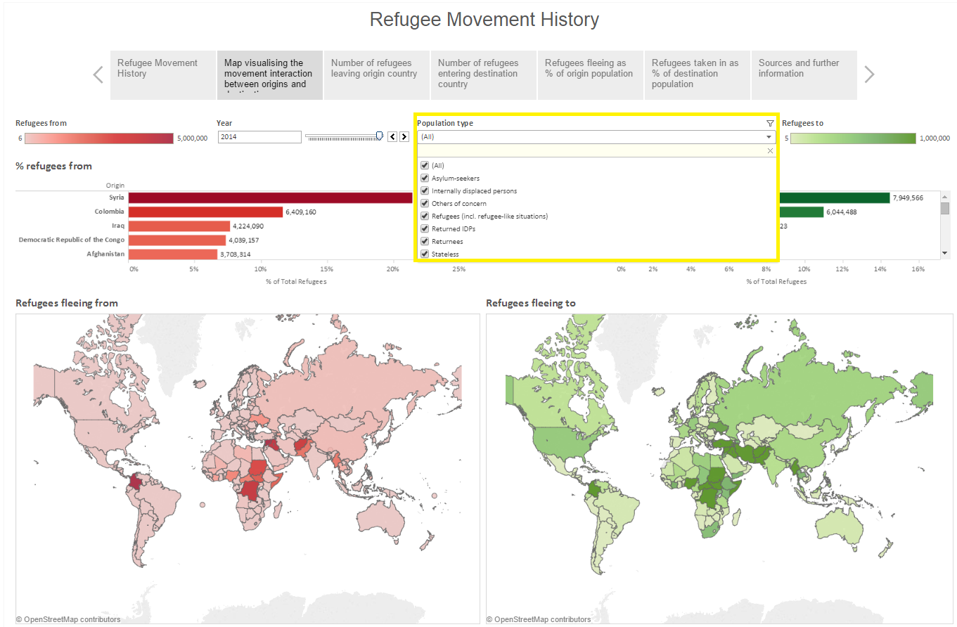
- Refugees include individuals recognised under the 1951 Convention relating to the Status of Refugees; its 1967 Protocol; the 1969 OAU Convention Governing the Specific Aspects of Refugee Problems in Africa; those recognised in accordance with the UNHCR Statute; individuals granted complementary forms of protection; or those enjoying temporary protection. The refugee population also includes people in a refugee-like situation.
- Asylum-seekers are individuals who have sought international protection and whose claims for refugee status have not yet been determined, irrespective of when they may have been lodged.
- Internally displaced persons (IDPs) are people or groups of individuals who have been forced to leave their homes or places of habitual residence, in particular as a result of, or in order to avoid the effects of armed conflict, situations of generalised violence, violations of human rights, or natural or man-made disasters, and who have not crossed an international border. For the purposes of UNHCR’s statistics, this population only includes conflict-generated IDPs to whom the Office extends protection and/or assistance. The IDP population also includes people in an IDP-like situation.
- Returned refugees are former refugees who have returned to their country of origin spontaneously or in an organised fashion but are yet to be fully integrated. Such return would normally only take place in conditions of safety and dignity.
- Returned IDPs refer to those IDPs who were beneficiaries of UNHCR’s protection and assistance activities and who returned to their areas of origin or habitual residence during the year.
- Stateless persons are defined under international law as persons who are not considered as nationals by any State under the operation of its law. In other words, they do not possess the nationality of any State.
- Others of concern refers to individuals who do not necessarily fall directly into any of the groups above, but to whom UNHCR extends its protection and/or assistance services, based on humanitarian or other special grounds.
The % refugees fleeing from/to
The % refugees from graph shows the total number of refugees either fleeing a country or being internally displaced (IDP status). That total number is also shown as a percentage of all countries for the specific year.
- Afghanistan has the highest rate overall since UNHCR began its mission – 16.83% of all types of refugees since 1951 have their origin there.
The % refugees to shows the total number of refugees any specific country has taken in, the total comprising all refugees of external origin and also IDPs. The total number is also shown as a percentage of all refugees either taken in or internally displaced for the specific year.
- Pakistan has taken in 9.62% of all refugees since 1951 (with origin both externally and internally).
- The tooltip additionally shows extra information discussed in the next couple of dashboards.
The refugees fleeing from and the refugees fleeing to maps interact together. Select a country that refugees are fleeing from, and the fleeing to map updates, indicating where the people fleeing that country fled to. The selection also updates the two graphs. Likewise, if selecting a country in the Refugees fleeing to map, the fleeing from map updates to show where the refugees taken in are coming from.

- Of all Iraqi refugees since 1951, 41.94% have been treated as refugees within their own country. Its neighbouring countries have then taken in the most refugees. In Europe, Germany and Sweden have taken in the most people.
- Of all refugees to have entered the United States, for the top 57.92% there is no information of where their exact origin was. Russia and Vietnam are the two biggest origin countries after that.
The next two dashboards are heat maps showing the same data, but laid out in a way to see movement over time, with the same origin and destination distinction. The original sort is based on the overall total of refugees since 1951.
Decade and Annotation
This can be filtered by Population Type, and also Decade and Annotation. Decade filters down the data in ten year periods, and Annotation turns the annotated information provided on and off. I’ve provided a very broad explanation for some of the spikes in the worst affected countries.
- For example, the Syrian Civil War is clearly visible in the data, as is the difficult conditions in Ethiopia that had people fleeing during the famine in the 1980s.
- Germany has become a steady refugee destination since the early 1980s, but have decreased the amount taken in since the early 2000s.
- The Annotation On/Off function is something I intend to bring up in a future blog, as it’s quite a nifty trick. I only used it on one of the heatmaps, because I couldn’t be bothered sourcing reasons for spikes.
The last two dashboards again show the same data, but showing the refugees as percentages of the origin population and destination population.
Decade and Population
- Filter by population and decade.
- The conflict between Azerbaijan and Armenia is clearly visible since 1993, where there’s been a steady flow of refugees in Azerbaijan. Armenia is also affected, but not as much when compared to their own population.
- Sweden and the United Kingdom take in refugees in the hundreds of thousands, yet when compared to their population the UK only took in 0.24% in 2014 as compared to Sweden’s 2.53%.
Conclusion
Hopefully, by visually presenting this data in a geographic fashion that shows refugee population where/from fluctuations, some insight can be gained into how this is not only an ongoing crisis, but also how it annually is growing in size. As the UN data has been getting better reported from its earliest modest estimations into today’s detailed breakdowns, trends in refugee movements following wars, natural disasters, and other crises can be more easily tracked. Those trends can then possibly – hopefully – be used to improve and get a better understanding of, for example, future government response plans and needs.
0 Comments
Trackbacks/Pingbacks